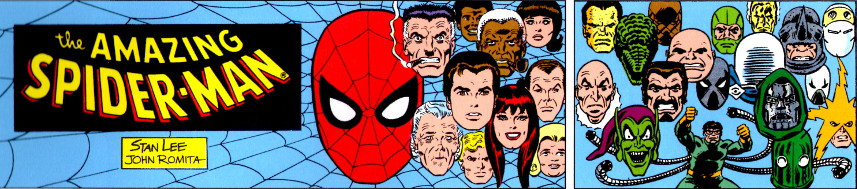
I suppose that this week’s column can be easily interpreted as the rantings of an older reader wishing, nostalgically, for the good old days while simultaneously contemplating how to tell the youngsters of the neighborhood to get off my lawn. But that is just a chance I’ll have to take.
In a nutshell, I long for the days when exposition was a lot clearer. I don’t mean that it has to be pedantic or employ a captain obvious character. But even in the good ole days where the art was high caliber and the visual layout very well done, sometime a few words was worth a hundred pictures.
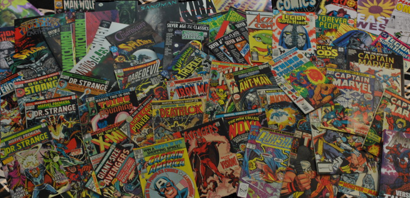
For example, take this action shot from the Spider-Man newspaper column.
It would not be at all clear what Spider-Man was trying to do without the thought bubbles that shared his inner narrative with the audience.
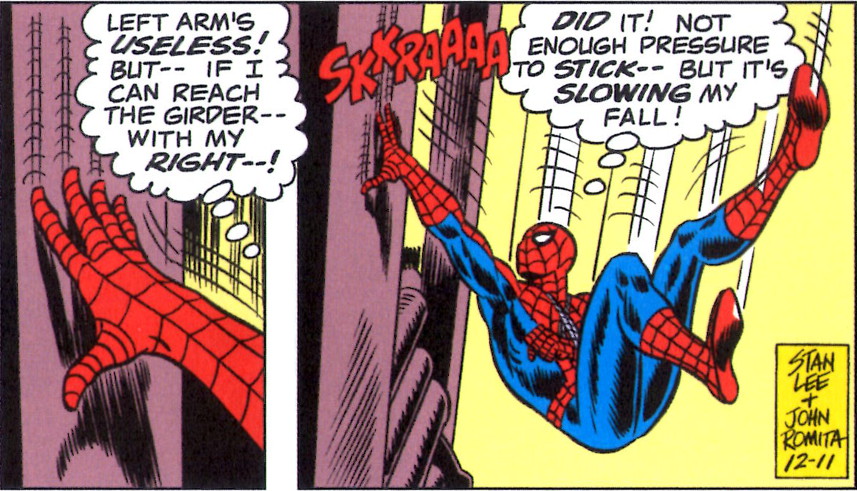
I appreciate that thought bubbles are considered old school now but is the story really enhanced by eliminating them? Also, I reject the contention that thought captions are actually new school as well. Consider the following two panels from Marvel Chillers #6 (1976)
These captions with a narration voice over are used consistently by Tony Isabella and John Byrne throughout the entire issue. Not one thought bubble to be found. While visually less jarring and cluttered – the captions being filled with color as opposed to bright white like the thought bubbles – the exposition is not significantly enhanced. Compared to the Spider-Man two-panel excerpt above, the Marvel Chillers piece contains essentially the same amount of inner dialog. Of course, the captions allow Byrne to zoom-in on the action but both sets are visually appealing and one might argue that which is used is a matter of taste. Has anyone mixed thought bubbles and captions? I don’t know.
Regardless of the answer, in both cases the writer had enough space to keep the reader comfortably current with the action. Unfortunately, that is not consistent with the current trends in comics. Too often, a minimalist approach is taken to the exposition which leaves me scratching my head as to how to interpret what I am seeing.
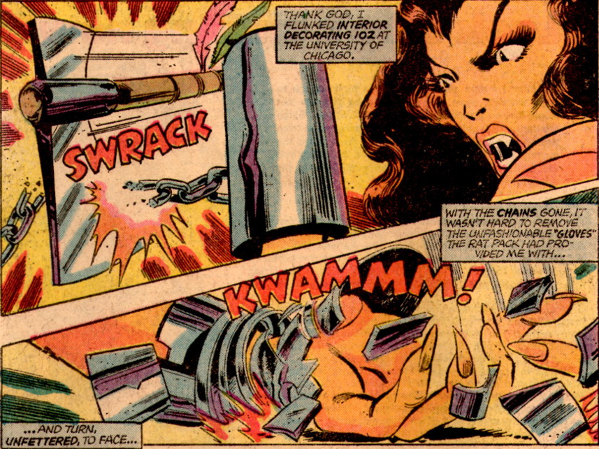
Consider the fairly recent attempts to knit together multiversal stories at Marvel. Certainly everyone is familiar with The Secret Wars event running through Marvel, but the original foray into that realm seems to have been the 12-issue run on The Defenders by Matt Fraction, Jamie McKelvie, and Mike Norton. I know that the Defenders had been cut loose from their mooring lines and cast adrift into the multiverse and I know that the experience is supposed to be disorienting to them. But it need not be disorienting to the reader. In issue #10, the reader is dropped into a scene of utter devastation
and left to fend for himself. Sure the art is striking and some bits of exposition are given later but it really ends up being too little to really shed light on what’s happening. Okay, real life is like that but so what? I don’t read comics to get real life – no one does. This problem is amplified by the Jonathan Hickman run on The Avengers and The New Avengers which culminated with The Secret Wars event that recently ended. I challenge anyone (even Hickman) to really make heads or tails of what Hickman was trying to say – to really make it make sense. Builders, and Beyonders, and Black Swans, and Molecule Men, oh my! To paraphrase Chesterton, the writer is under a contract to explain the events to the reader. The reader takes delight not in the mystery but in the explanation that makes it clear.
Couple minimalist story with bad art and the situation gets even worse. The art on Roche Limit was so minimalist that I often had a hard time telling one character from another.

All of them had distinguishing characteristics so that when viewed side-by-side they were distinguishable but none were memorable enough to jump off the page and stick in my thought until the next issue came out. Could it have hurt the writer to remind me that this simple line drawing above represents Sonya’s sister Bekkah. There’s plenty of space in the speech balloon to both add that information and improve the exposition with dialog more like ‘Have you ever seen this girl? Never? Didn’t she ever stay here or visit? Her name’s Bekkah… she’s my sister.’ Five extra words but a world’s worth of difference. Without it I am stuck having to reread the series each time a new issue is added to the fold.
I miss the days when master artists made each character distinct.
Today, even in reasonably well-crafted books like The Sixth Gun, there are still scenes like
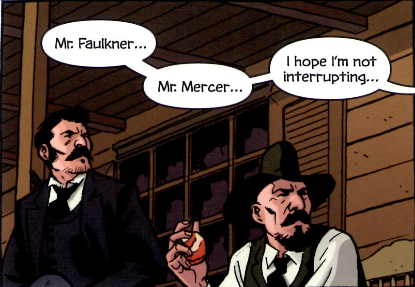
where I wonder if I am reading a comic or playing the old children’s game Guess Who (does your cowboy have hair? Does he have a hat? Mustache of full beard? Don’t tell me – they have the same nose!).
So if any creators actually stumble on this post, please do your readers a favor, do your sales figures a favor, and do yourself a favor, work on the exposition.