This week, I’ve decided to look at a current comic that has published a piece from their team on ‘the making of the magic’ as well. I am speaking about the ongoing series from Image called The Wicked + The Divine.
Like the last two entries, the source of this column is the additional material included in a reprint volume. In this case, the publication is the trade paperback collection of issues #6-11 entitled The Wicked + The Divine Volume 2: Fandemonium.
The creative team is comprised of Kieron Gillen, who is the author, and Jamie McKelvie and Matt Wilson, who are listed as illustrators. In the additional material showing how Gillen, McKelvie, and Wilson put together an issue, there are frequent, good-natured jibes at Gillen who is always referred to as Keiron (e.g. this is why we don’t let Kieron draw).
The premise of The Wicked + The Divine revolves around an event called the Recurrence that starts every 90 years and persists for about 2 years. During the Recurrence, 12 gods or goddesses from the world’s collective mythology suddenly intrude into the lives of ordinary people. One minute, the person in question might be Joe the next minute he is Hermes, or Vishnu, or… There doesn’t seem to be any rhyme or reason for how the 12 are selected but this may be a future plot point.
Becoming a god offers a host of advantages. Not only is one able to wield magic but one becomes an immediate media darling and is worshipped by thousands upon thousands of followers/fans. The downside is that one has 2 years to live (perhaps less – it isn’t clear if all the gods ‘go away’ at the same time). The lesson here I suppose is that the candle that burns brightest burns half as long.
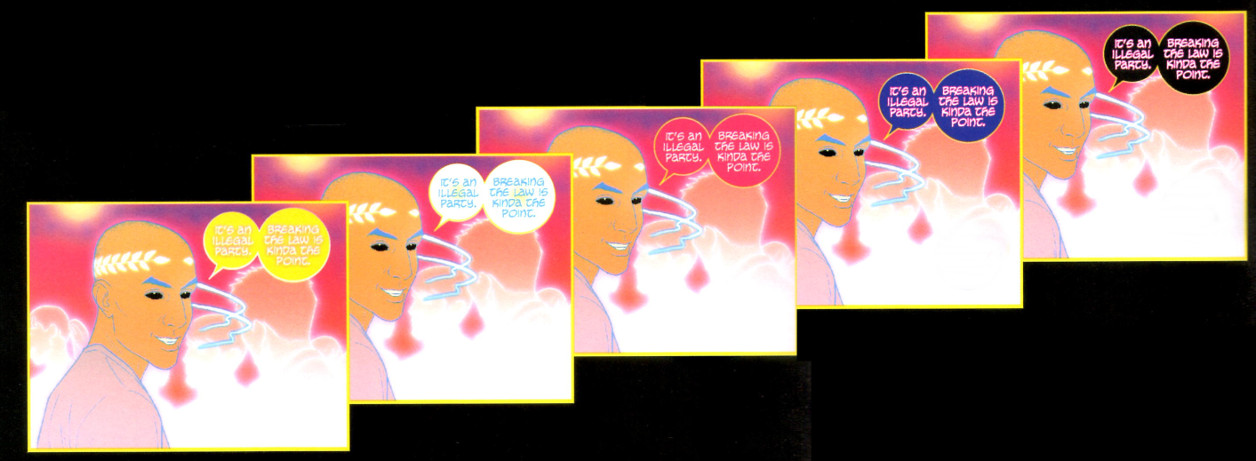
Anyway, being a modern comic, much of the material in the ‘making of’ section includes digital effects types of things. For example how 3D computer models are joined with pencil sketches to make a composite page for a large Woodstock-type festival or how the particular speech of a god is crafted as in the following example, where the color of the word balloon was experimented with to get the correct motif for the festival god (Dionysus) in question.
Of course color and form are important aspects of the storytelling but the central concept is the narrative that moves the story and the plot along. The creative team offer us some looks at what worked well, what worked adequately, and what, perhaps, went awry.
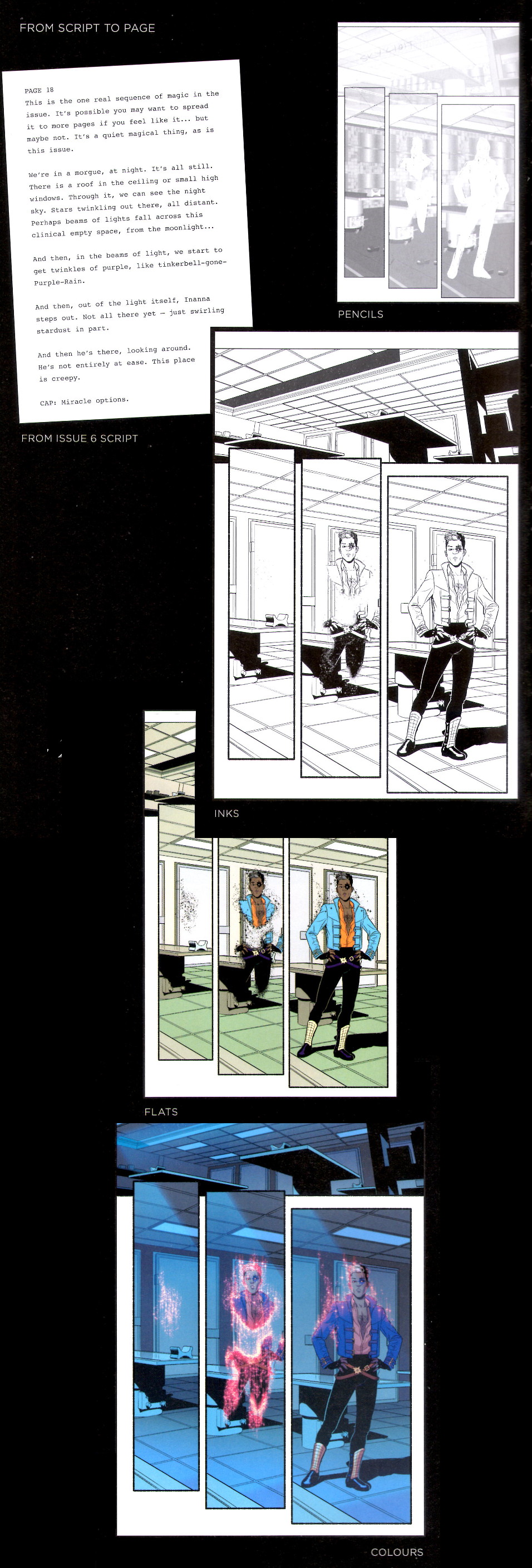
As an entry under the heading ‘worked well’ consider the following script page and its evolution from words to pencils to finished layout.
Note the limited amount of descriptive prose associated with the page. Compare this with the previous two methods discussed. In the Feldstein method, the writer/editor, provided the dialog, the captions, and the page layout to the illustrator. In the Gaiman method, the writer provided a screenplay with the desired page layout, the dialog, the captions, and large amounts of additional imagery. In this example, the Gillen simply provides a sparse set of directions indicating the mood. He even says
But otherwise, lets the overall imagery fall in the hands of the illustrator team. The resulting page is successful in that it conveys both the quiet nature of the magic (a slow fade in rather than a pop) and the creepy nature of the morgue but I can’t help feeling that the pose struck by the god doesn’t fit the solemnity of the scene or the reason for his visit.
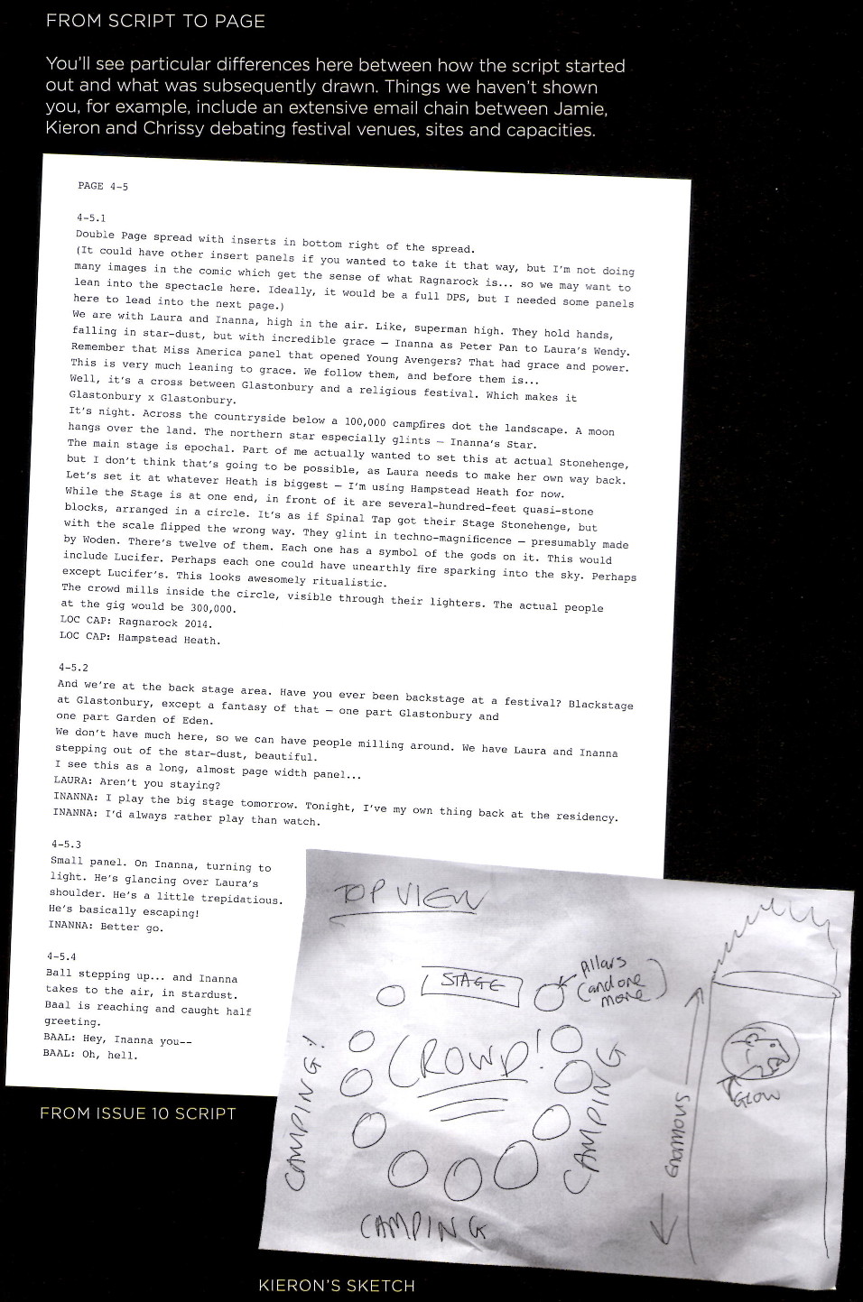
Another example from a later issue is the arrival at the Ragnarock festival where the 12 gods are being adored by their irrational fans (are there any other kind?).
This script from Gillen has a lot more descriptive imagery than the earlier page, including a specific call for the page layout (DPS = double page spread) and he also includes a rough sketch of the top view and two of the lead characters (Inanna and Laura) as they arrive at this Woodstock-meets-cult-gathering (or Glastonbury meets Garden of Eden as the author describes it).
The final page spread captures these basic ideas but the structure of it is quite a bit different in angle and, I would argue, in tone. The stage and 12 standing stones were produced with a 3D CAD-type program and the additional pencils were mated to this image to produce the final result. I think this mixing of methods results in an overall image that straddles the two worlds (digital and analog) without achieving harmony with either.
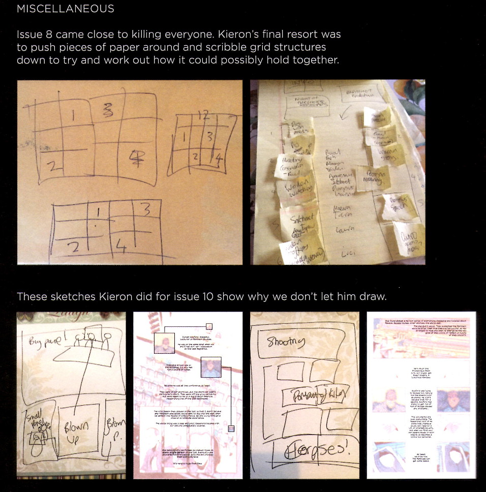
The final example I’ll consider, comes from issue #8, which is set at one of the psychedelic parties thrown by the god Dionysus. The idea for the layout is that the panels should reflect the dance beat in the background. By and large, I found the end result hard to follow and dissatisfying, in that it interfered with following the story. While there are profound similarities to film, comics are fundamentally a static medium and trying a ‘1-2-3-4’ beat doesn’t work for me (see CBR’s review for a different take).
It was interesting to see how Gillen tried to work the page layout in terms of a grid with little pieces of paper.
This approach got me wondering if other creative teams use different size sticky notes to play with page layouts. I’ve not heard of such a thing but perhaps it is done.
As I close this look at The Wicked + The Divine, I can’t help but note that creative process seems to focus more on style and less on substance. The story seems to be relegated to a lesser role compared with the older instances examined in the previous columns. Perhaps this is due to the fact that the whole premise of this comic is style and its cult of personality but I am not so hopeful. It seems to me that the new technologies have seduced creators (these, specifically, and others, generally) into producing comics with a lot of art and fury signifying very little.
