My source for this installment is issue number 17 of the Sandman 1989 series. The story contained in this issue is entitled Calliope, which was written by Neil Gaiman, penciled by Kelley Jones, inked by Malcom Jones III, and edited by Karen Berger. This story is the first of four comprising the Dream Country arc that ran in the late fall of 1990.
In the collected work of the same name, additional material is provided in an appendix. One such included piece is a reproduction of the full script that Neil Gaiman produced in advance of the production of the full comic. Included on the script are annotations provided by Gaiman, Kelley Jones, and Berger detailing some discussion points about the content, layout, and art.
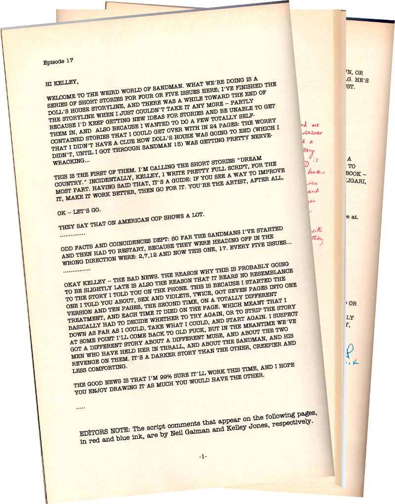
For the trade paperback collection, Gaiman also provided an introduction to the script to set the stage. Some of the particulars are useful in understanding his method and the creative iterations that took place within the team.
He starts by stating his original desire to write comics
I have always wanted to write comic.
But I could never figure it out; how did a writer get the story in his head onto a comics page? What did a comics script look like? What did a comics writer do?
Gaiman then goes on to tell that his break came from a discussion with Alan Moore
I eventually found out, by asking someone who wrote comics …and getting him to show me what a script looked like, and how it was laid out. This he did, on one side of notebook paper.
Once I knew what a comics script looked like, the rest was easy. (No, that’s not true. The rest was pretty difficult; and every story presents its own set of problems. But you know what I mean.)
His method is described as follows
I always make a small doodled version of the comic while I’m writing, to let me know how many panels I’m putting on a page, and to suggest ideas of layout and storytelling.
Each SANDMAN script is a letter to the artist (I drive Karen Berger…crazy, by refusing to write a script unless I know who’s going to draw it; if you write for an artist you can play to their strengths. It makes you look good); and this is a letter to Kelley Jones.
The script runs 39 pages and, in many ways, reads like a play. There are discussions about each page and panel as well as considerations on what to do when the issue becomes reprinted in a collection, where ads will be in the issue, and so forth. Script comments are found in the margin (and in some cases, annoyingly over the text) and differ by color based on team member; red for Neil and blue for Kelley.
By my count, each of them provided 20 comments, mostly about the story but occasionally about other related topics, like how far Gaiman could progress on the story or something about one of their acquaintances. Despite their equal tally, as expected, Gaiman’s comments are a lot wordier.
It seems instructive to take a few pages apart and to compare the final product to the working script. Page 1 on the published story looks like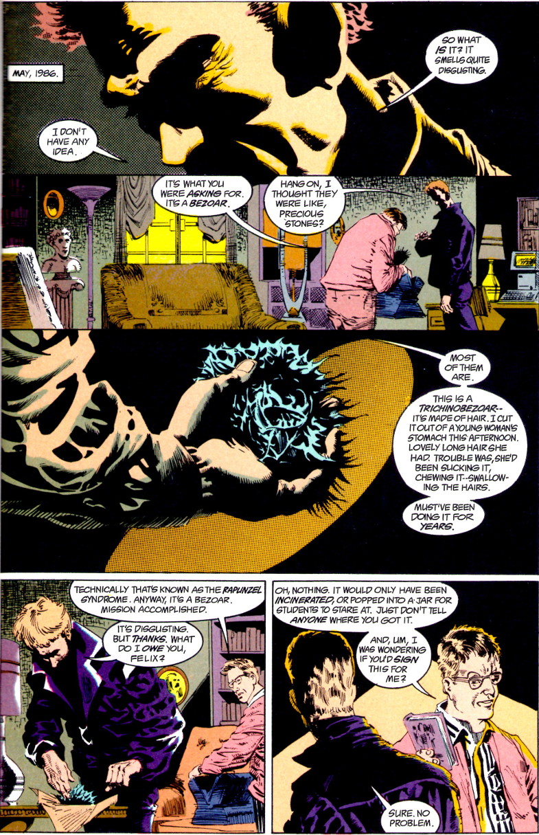
It has 5 panels, three of which overlap and with two distinct gutters. It what follows, I’ve combined the script and the panel into one figure for easy, side-by-side comparison.
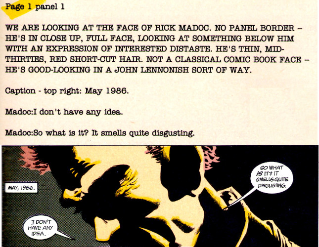
Page 1 Panel 1
Page 1 Panel 2

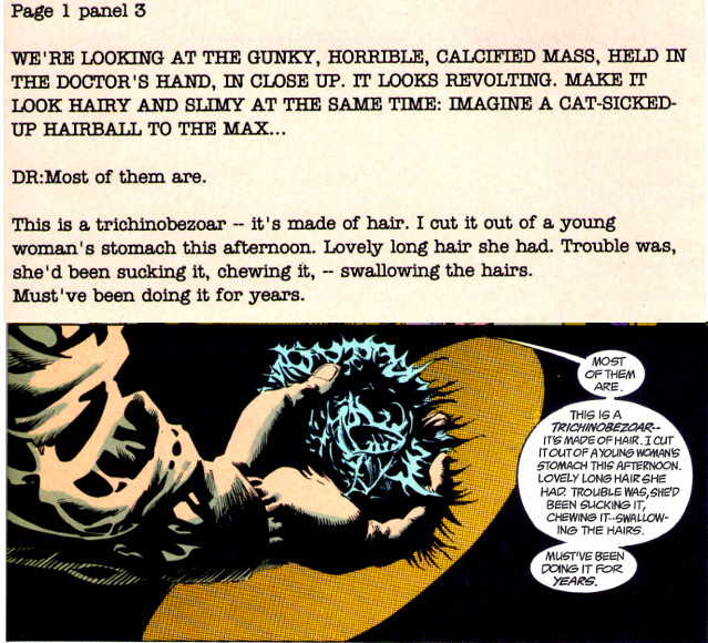
Page 1 Panel 3
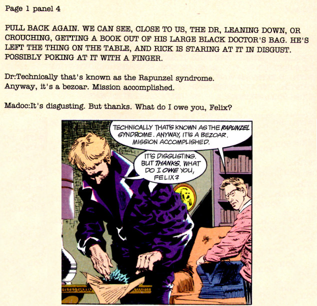
Page 1 Panel 4
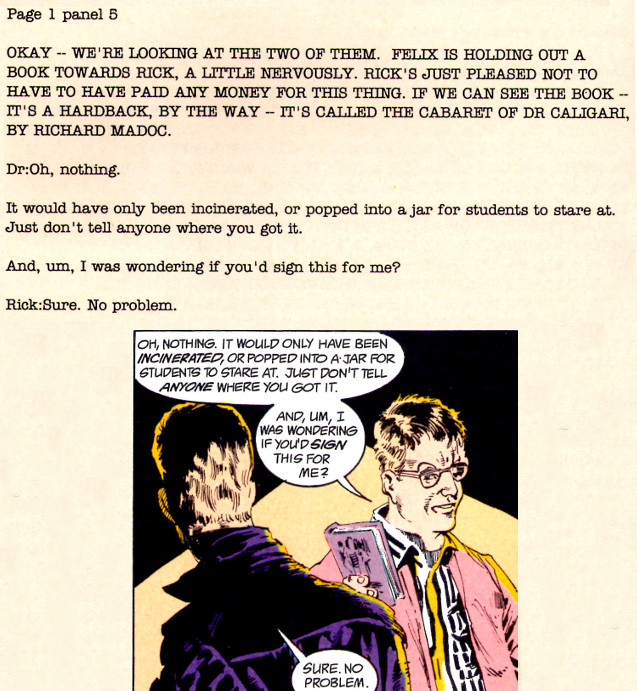
Page 1 Panel 5
Note how closely the artist’s rendition matches the writer’s description. Part of this is due to the detail that Gaiman provides Jones, but I think part of this is also due to the fact that Neil knows where he is going with the story and Kelley is at a disadvantage, since the characters aren’t familiar to her. As the story progresses, Kelley seems to assert herself more.
After five pages of what is basically prologue, the splash page appears on page 6, bearing the creative teams credits.
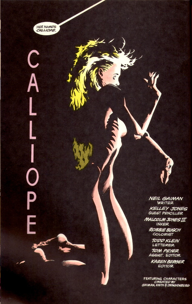
The accompanying description from Gaiman is
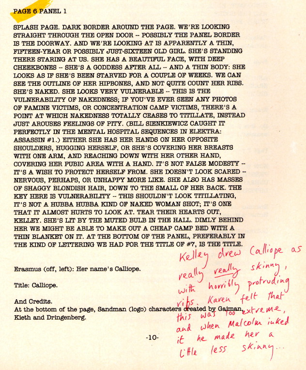
Note that discussion about imagery and how it relates to Calliope’s nudity and the script comment about the extremes that Kelley Jones employed to portray the capture Muse as emaciated and how the inker ‘fixed’ it after the editor complained.
Page 9 is particularly interesting as the script called for a traditional 3 tier panel layout (similar to the EC layout discuss in last week’s column)
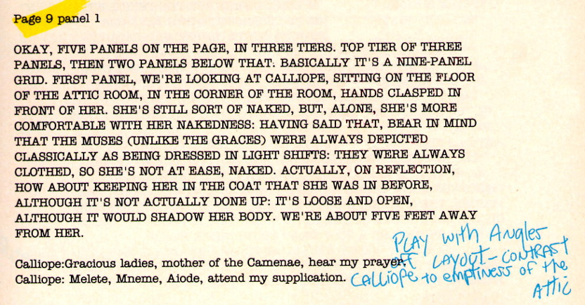
but the final product is quite different
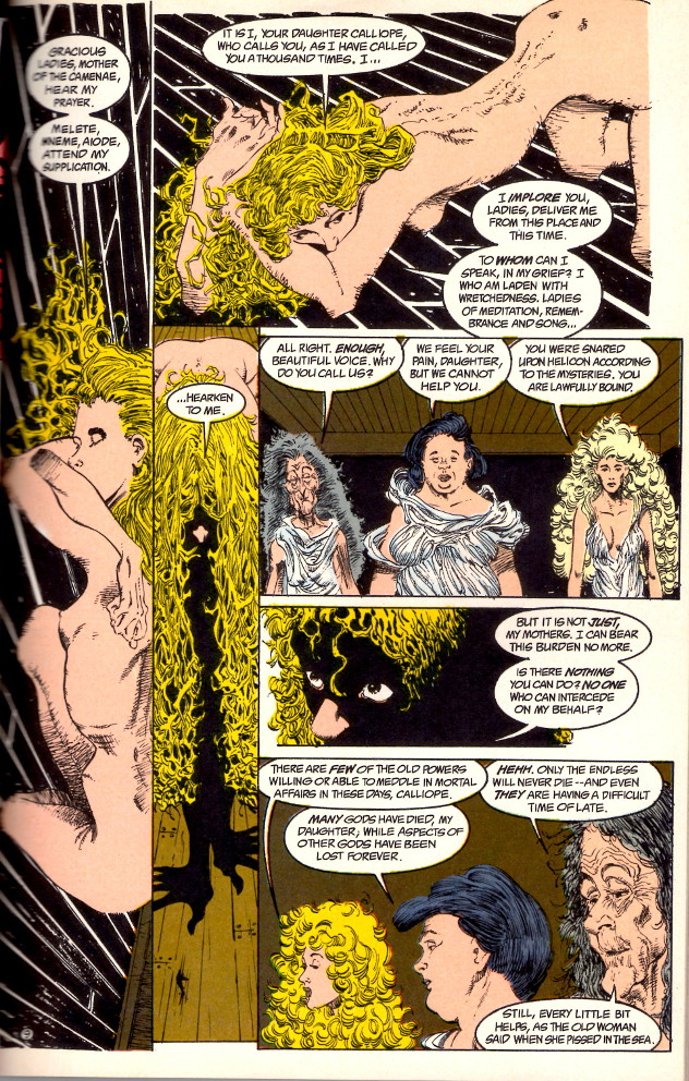
Based on the script comments, Kelley Jones decided that the final layout was more evocative. It seems that Gaiman agreed.
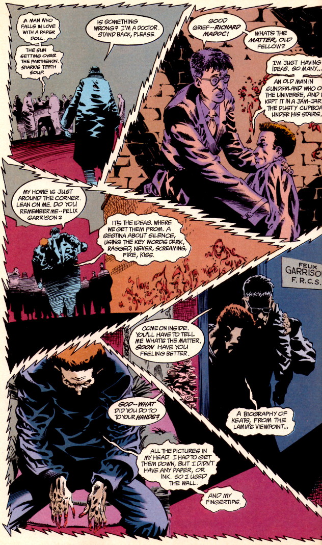
At other points in the script, Gaiman is more definitive with his art direction. For example, later in the story, the main character suffers madness at the hands of the Sandman and his perception of reality begins to degrade, splinter, and eventually shatter. Gaiman calls on Kelley to render the panels to reflect the madness. To this end he specifically asks for ‘really jaggedy panels’ but leaves the specifics to her discretion and he follows suite with
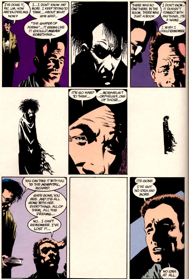
As the last example, for the final page, Neil carefully crafts a 3×3 grid of panels that alternate views between the main characters external perception (his conversations with his friend) and his internal world, where the fonts of all ideas (the Sandman) wink out of existence.
Obviously, in this approach, the writer is the primary creative force with the artist providing the rendering that matches the description. Clearly this favors someone like Neil Gaiman, who has strong feelings about exactly how his story should be told. Unfortunately, there is no explicit record of how his artists feel about this approach. But judging from Kelley’s alterations and script comments in the margins, it seems that she enjoyed the collaboration.