Words and Comics
Last month’s exploration of the triumphs, trials, tribulations, and tensions between the creative work of Stan Lee and Steve Ditko got me terribly nostalgic for a time. Looking at all those works from the 1960s and 70s brought out the old feeling that the new stuff isn’t as good as the old stuff.
There are certainly many ways to criticize that feeling and I have engaged in them all. I tell myself that many of the comics I read as a child formed my expectations, particularly where the art style and subject matter are concerned. My emotional and mental maturity wasn’t as great then as it is now. I’m out of touch with modern approaches. And so on.
While I’ve considered each and every one of those possible objections, none of them explain my admiration and enjoyment of the old Golden and Silver Age books. After all, I wasn’t exposed to the Golden Age material until I was well into my third decade and my appreciation the Silver Age material came even later.
To be more concrete, let’s take the following page from Avengers #134 from 1975:
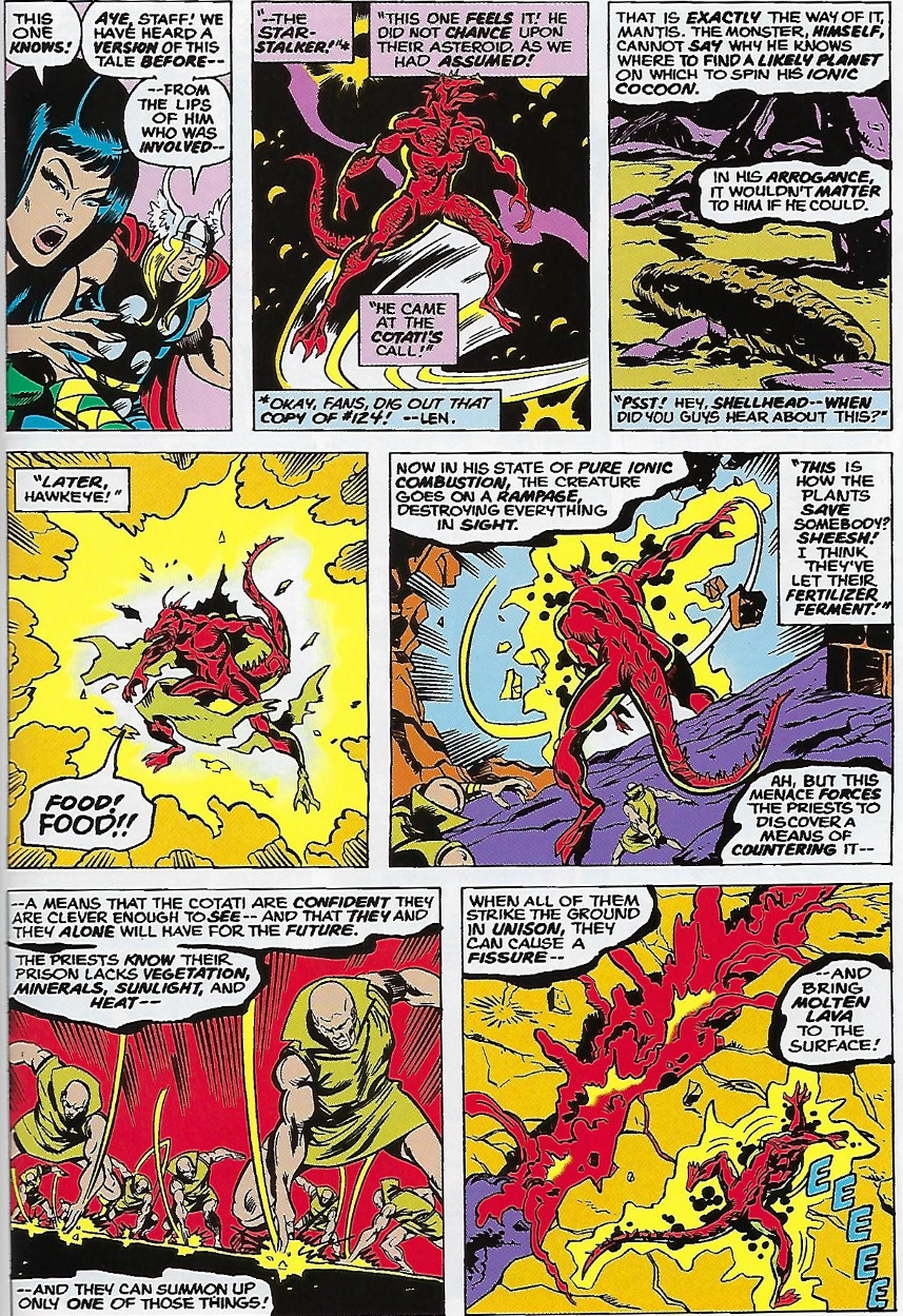
This is one of the scenes from the Steve Engelhart’s Celestial Madonna storyline in the Avengers. The art is from Sal Buscema (illustrator) and Joe Staton (inker). The content is pure, trippy, new age cosmic metaphysics – a blend of science fiction and mysticism. To give a flavor of just how trippy, the storyline centers around Mantis, a character created by Engelhart, who is a combination priestess, martial artist, whore, and celestial savior. The storyline culminates with her marriage to a dead lover who, after his demise, had become reanimated by an intelligent plant species.
Consider now this page from the Golden Age appearance of the Sub-Mariner from Marvel Comics #1 from 1939.
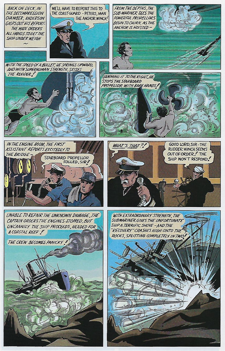
The brainchild of Bill Everett, this version of the Sub-Mariner is quite different in visual style, content, and mood from the Bronze Age version. No cosmic opera, no galactic scope, no celestial superpowers. The entire story has quite a different look-and-feel in all aspects, and yet there is a charm in these pages that captures my interest.
Likewise, the following page from Crypt of Terror #19 (1950) from the short story entitled Ghost Ship with story and art by Al Feldstein.
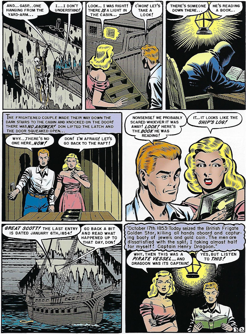
This is a traditional ghost story about a couple who ‘find’ a derelict pirate ship and slowly unravel a tale of violence and betrayal from centuries earlier. The style and mood are clearly the gritty 1950s and they are a far cry from either the light-hearted adventure of the Sub-Mariner or the cosmic opera in the Avengers.
I find all these styles enjoyable and satisfying; both the styles from my youth and the styles I encountered as a result.
Now let’s look at a more modern offering. For this case, I offer one of the more egregious examples I’ve found from Iron Man #77 (2004).
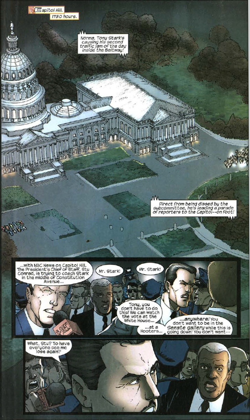
I tried to put into words just what was wrong. At first, I thought it was simply a matter of style. The art, while technically competent, is uninspiring and fairly monochromatic. There isn’t much in the way of movement or action or dynamism nor is the dialog interesting and or engaging.
Later, I decided that none of these critiques quite captured the essence of my distaste. A counterexample to most of these critiques is the following page from the Thanos Imperative #4 from 2010.
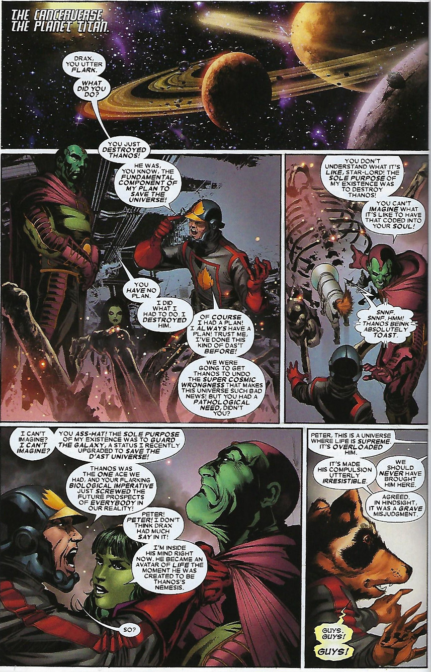
The art is of a higher quality than the Iron Man example above. The dialog is better as well, even if it is a bit long-winded and ponderous. There are traditional panels and gutters compared to the panel-on-top-of-panel style in the previous page and the color scheme has a lot more variation. So technically, this page was better in most aspects than the Iron Man example and yet there I was still unsatisfied. Somehow, the thing that was bothering me was escaping my ability to articulate.
The only place left to turn, now that subjective art critiques had failed, was to collect some objective data. To this end, I semi-randomly chose 32 different pages spanning the Golden, Silver, Bronze, and Modern Ages. My only criterion was to find pages from material I liked and disliked that had roughly the same structure – a page with a mix of dialog and action. Once selected, I simply counted the words on the page and how they were distributed by panel to produce 3 statistics: total words per page, the number of panels per page, and the average words per panel.
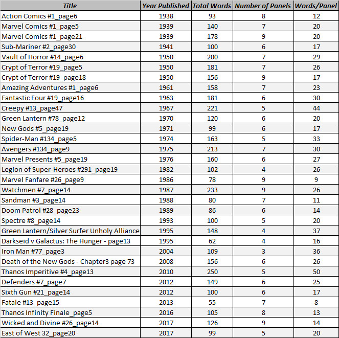
The following graph, which shows the total number of words per page as a function of year shows that there is only a slightly discernable trend over the time span that tends to suggest that the number of words per page has dropped modestly in the Modern Age.
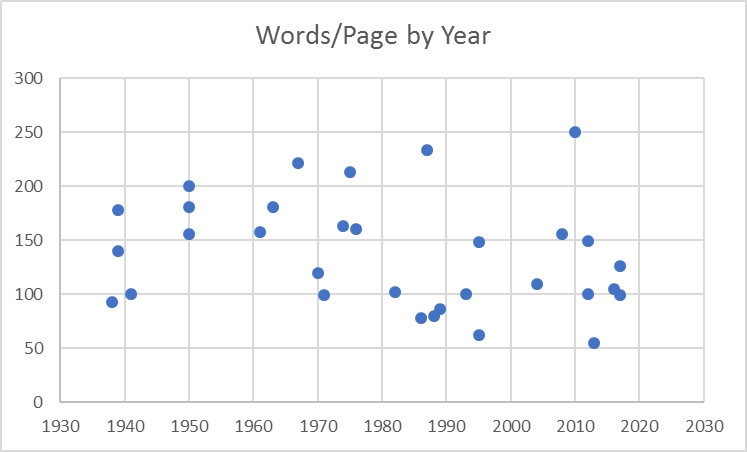
The variation in the number of words per page by year is mostly a function of the author rather than the style of any of the ages.
The graph of words per panel shows no trend whatsoever.

Apparently, the same amount of verbal information, to within variations due to story demands and author, is being conveyed.
However, when the panels per page is graphed, a fairly discernable trend appears.
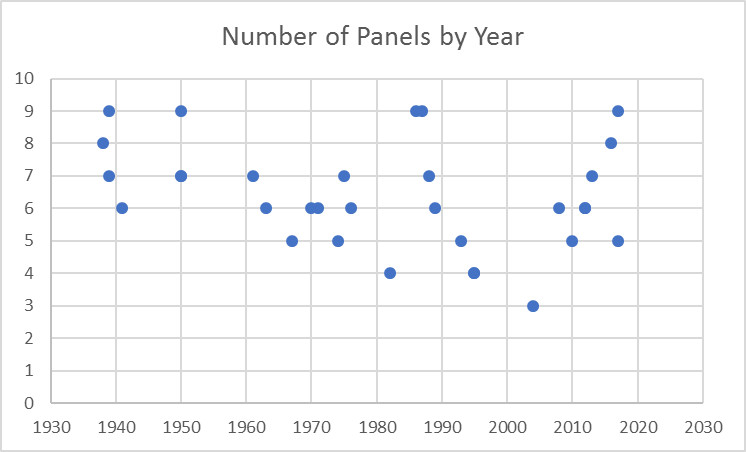
Over the time span from 1940 to 2000, there is a continuous drop in the number of panels presented on the page. When I went back and looked at the Golden Age stories, the style was to push a large number of small panels onto every page. This made the page look rather busy. This practice was eventually dropped and, over the course of years, the number has slowly declined until it hit a minimum around 2004/2005.
After I found this result, I reexamined the Thanos Imperative series. Most pages have only 3 or 4 panels and the example I provided above was a rare case with 5. As the number of panels has been dropping, the industry had been cutting back in storytelling content in way that was far from obvious by examining art style or dialog content.
So, there you have it. My distaste with the Modern Age style (at least in the mid-2000s) was due to the fact that I was aware on a subconscious level that the industry was gipping me out of a bunch of storytelling. If a picture is worth a thousand words, then a drop in the average number of panels per page from the value of 8 in 1938 to 4 in 2005 is literally a drop of 4000 words per page. Given that there are roughly 20 pages per comic book, that amounts to 80,000 word per book. We all have paid for millions fewer words than we would have gotten decades earlier. Fortunately, that trend seems to have reversed a little and that’s all to the good.