Monthly Archive: July 2015

Story Construction – Part 5: More Moore

This week, I start my review of the approach to creating comics authored by Alan Moore.  An earlier column touched upon Moore’s approach as viewed through the lens of Neil Gaiman, who claims to have learned his technique directly from Moore.

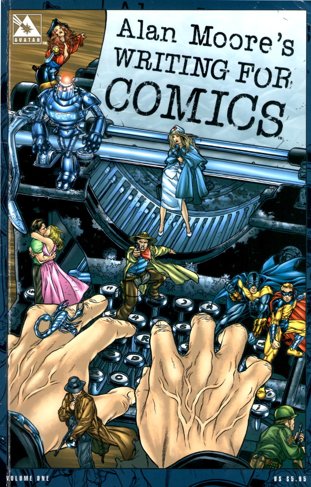
For those who don’t know, Alan Moore is credited with a fresh approach to comics in the mid-eighties with his tenure on Swamp Thing, Watchmen, and various other titles.  Shortly after his success, Moore authored the book entitled Alan Moore’s Writing for Comics.  The edition that I reviewed was a reprint of the original work with an added Afterword section that was published by Avatar Press in 2006.

Alan Moores Writing for Comics

As a writer, Alan Moore’s approach to story construction is obviously text-based.  That said, it was remarkable how little he dwells on the imagery of the comic in his text.  He chooses to confine the majority of his discussion to the thinking process associated with the creating comics.  He explicitly avoids saying how he does it

…I don’t want to produce anything that smacks even remotely of “How to Write Comics the Alan Moore Way.” Teaching a generation of emergent artists or writers how to copy the generation that came before was a stupid idea when Marvel  introduced their “How to Draw…” book and it would be equally irresponsible of me to instruct up-and-coming writers on how to write sickly extravagant captions like “Dawn transformed the sky into an abattoir or whatever.”

Alan Moore

Rather he discusses how to think about the craft of comics writing.  The main point here is that a story should be useful in some way – it should be relevant to the reader.  He feels that changing printing techniques, adding new characters or new computer graphics won’t make a difference unless the fundamental assumptions of the artform are challenged.  And he identifies comics writing as the greater area of focus because it is the very start of the process; the bones on which the flesh of the story is hung.

Story Structure

Moore urges the reader to understand the structure of the work that he is creating; even if the creator is deviating from it, it is important to know that he is.  He identifies four types of story structure, most of which he used in his run on the Swamp Thing (note some of the terminology is mine):

  • Elliptical structure – the elements of the beginning of the story mirror those at the end
  • Middle-Outwards – the story starts in the middle and the background is filled in a way that interleaves the pieces with the current story line
  • POV – the same narrative of the story is told by more than one character and only by sifting through the various pieces can the reader determine the facts
  • Gimmick – a central piece, like a poem, is used around which the rest of the structure is placed

Once the basic notion of the structure is chosen, Moore then identifies areas of story composition.  In this category he includes

  • Transitions – movement between one scene and another
  • Pacing – the intellectual speed at which that the reader moves through the story
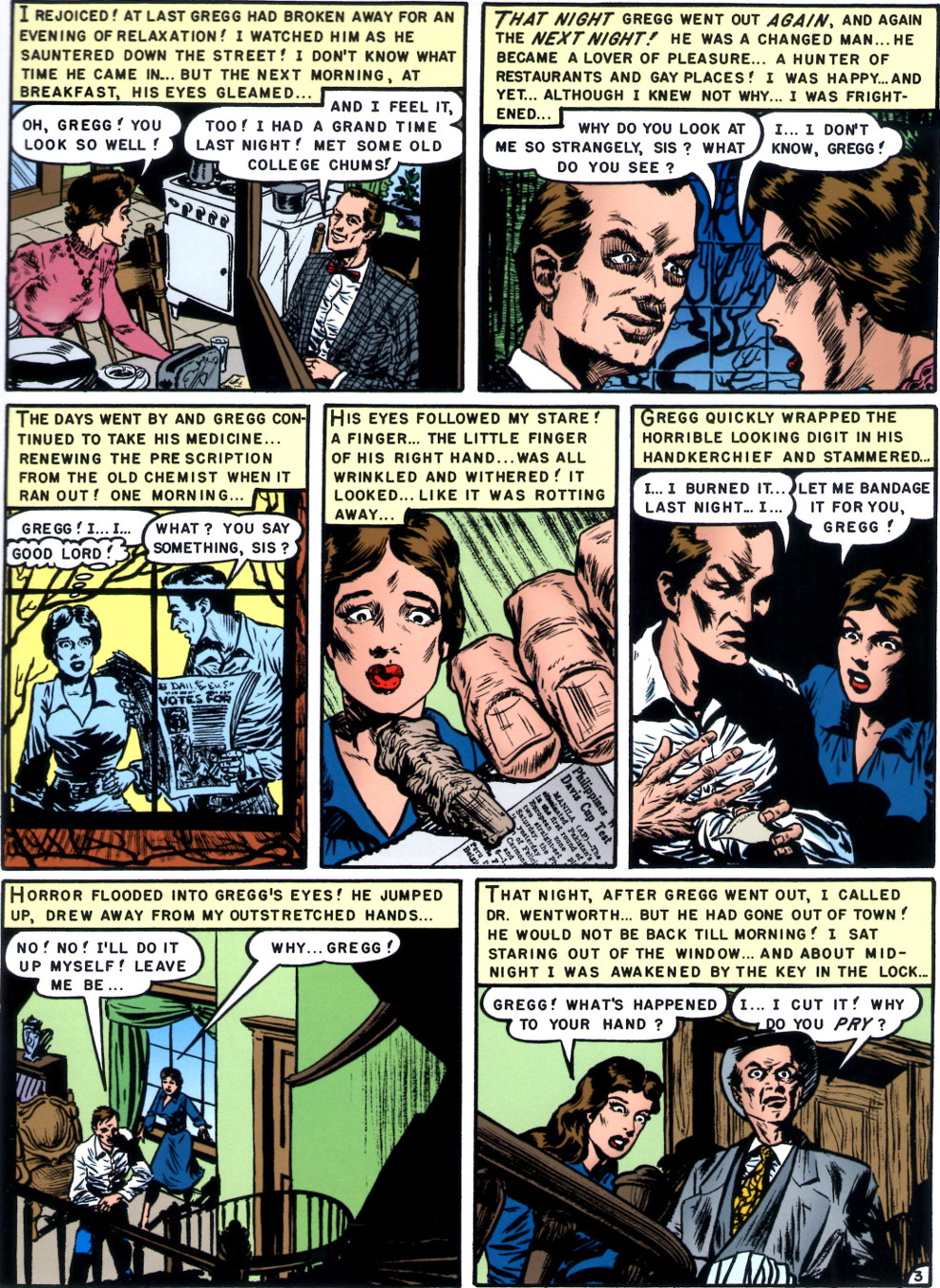
  • Rhythm – the balance between active and passive panels*
  • Smoothness of flow – overall package of the above*

* Note that these definitions are my own based on my reading of Moore’s intent.

Transitions

Moore labels transitions as one of the trickiest and intriguing elements of the whole story process.  The aim of the transition is to move the reader’s attention from one element to another without disturbing his immersion in the story.  Moore’s idea is that the reader voluntarily subjects himself to a kind of hypnosis when reading the comic and the last thing that the creator wants to do is to disturb this with an awkward change in focus.  Several concepts are proffered as ‘tricks’ to make the transitions better.  These include:

  • the use of overlapping or coincidental dialog,
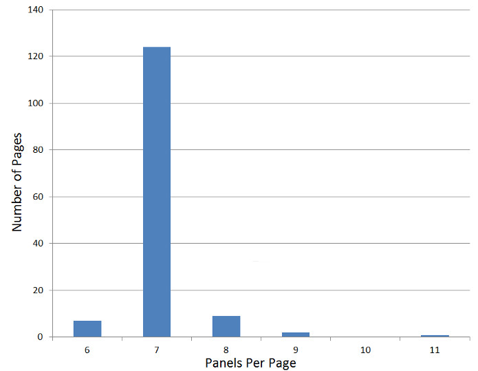
  • writing in basic units of a page,
  • and a repeat of images or concepts (e.g., an idea or a color) between scenes.


Moore does emphasize that the transition need not be smooth if what the creator is aiming for is a jarring change of attention.  But again, this is one of these ‘it’s okay to break the rule if you know you are doing it moments’.

Pacing

The idea here is to meter out the duration that it will take a reader to complete their passage through an entire page.  Moore doesn’t have a lot to say on this front.  He does cite a standard of 35 words per panel, a figure that I had never encountered prior to reading this piece.  According to him, an average reader spends 7 to 8 seconds on such a panel.  Moore believes that by dwelling on these sorts of concepts, the creator can exercise some control over the duration that the reader spends on each page.  To quote Moore

If you read a few comics with the pacing in mind you soon get a workable intuition for how long the reader will spend on each picture.  While this doesn’t give you anything like the rigid control of the time frame enjoyed by the film industry … it does grant you some broad measure of control over how long it will take the reader’s eyes to be guided through the whole page.

Alan Moore

This assertion seems highly questionable based on earlier comments made about the differences between literary works (e.g. novels, short stories, etc.) and film.  Moore makes a  particular point about the strengths afforded the written work – particularly that the individual reader can set his own pace; moving forward and even backward as he see fit.

What I believe that Moore actually means is that the creator can set the minimum time that the reader must spend on each page by tailoring the amount of written versus rendered information.

Rhythm & Smoothness of Flow

If Moore says precious little about pacing then he says even less about rhythm and smoothness of flow.  Specifically, he never mentions them by name again.  Getting beyond that point, one can infer possible meanings for him listing them in the first place.  The starting point for guessing what he had in mind comes from his insistence that the story is a kind of hypnosis that the reader voluntarily enters.  The immediate interpretation is that rhythm is the balance and metering of active versus passive panels. An active panel is one predominantly communicating movement whereas a passive panel communicates location, or thought, or dialog.  As far as I know, this terminology is peculiar to me.

This inference is bolstered by Moore’s discussion about the elegance of the fight sequences of Frank Miller, where the active panels are completely devoid of dialog.  The action is allowed to happen as in real life without being cluttered by a lot of words.

The smoothness of flow is then judged as the complete package where active and passive panels are knitted together with the pacing and transitions working seamlessly to keep the reader engaged.

Next week, I finish up my summary of the theoretical study of Alan Moore’s Writing for Comics, where I will cover world building and plot and script.

Story Construction – Part 4: Wickedly Divine

This week, I’ve decided to look at a current comic that has published a piece from their team on ‘the making of the magic’ as well.  I am speaking about the ongoing series from Image called The Wicked + The Divine.

Like the last two entries, the source of this column is the additional material included in a reprint volume.  In this case, the publication is the trade paperback collection of issues #6-11 entitled The Wicked + The Divine Volume 2: Fandemonium.

The creative team is comprised of Kieron Gillen, who is the author, and Jamie McKelvie and Matt Wilson, who are listed as illustrators.  In the additional material showing how Gillen, McKelvie, and Wilson put together an issue, there are frequent, good-natured jibes at Gillen who is always referred to as Keiron (e.g. this is why we don’t let Kieron draw).

The premise of The Wicked + The Divine revolves around an event called the Recurrence that starts every 90 years and persists for about 2 years.  During the Recurrence, 12 gods or goddesses from the world’s collective mythology suddenly intrude into the lives of ordinary people.  One minute, the person in question might be Joe the next minute he is Hermes, or Vishnu, or…  There doesn’t seem to be any rhyme or reason for how the 12 are selected but this may be a future plot point.

Becoming a god offers a host of advantages.  Not only is one able to wield magic but one becomes an immediate media darling and is worshipped by thousands upon thousands of followers/fans.  The downside is that one has 2 years to live (perhaps less – it isn’t clear if all the gods ‘go away’ at the same time).  The lesson here I suppose is that the candle that burns brightest burns half as long.

Anyway, being a modern comic, much of the material in the ‘making of’ section includes digital effects types of things.  For example how 3D computer models are joined with pencil sketches to make a composite page for a large Woodstock-type festival or how the particular speech of a god is crafted as in the following example, where the color of the word balloon was experimented with to get the correct motif for the festival god (Dionysus) in question.

W&D_balloons

Of course color and form are important aspects of the storytelling but the central concept is the narrative that moves the story and the plot along.  The creative team offer us some looks at what worked well, what worked adequately, and what, perhaps, went awry.

As an entry under the heading ‘worked well’ consider the following script page and its evolution from words to pencils to finished layout.

W&D_script_to_page

Note the limited amount of descriptive prose associated with the page.  Compare this with the previous two methods discussed.  In the Feldstein method, the writer/editor, provided the dialog, the captions, and the page layout to the illustrator.  In the Gaiman method, the writer provided a screenplay with the desired page layout, the dialog, the captions, and large amounts of additional imagery.  In this example, the Gillen simply provides a sparse set of directions indicating the mood.  He even says

It’s possible you may want to spread it to more pages if you feel like it…but probably not.

– Kieron Gillen

But otherwise, lets the overall imagery fall in the hands of the illustrator team.  The resulting page is successful in that it conveys both the quiet nature of the magic (a slow fade in rather than a pop) and the creepy nature of the morgue but I can’t help feeling that the pose struck by the god doesn’t fit the solemnity of the scene or the reason for his visit.

Another example from a later issue is the arrival at the Ragnarock festival where the 12 gods are being adored by their irrational fans (are there any other kind?).

W&D_script_to_page_2

This script from Gillen has a lot more descriptive imagery than the earlier page, including a specific call for the page layout (DPS = double page spread) and he also includes a rough sketch of the top view and two of the lead characters (Inanna and Laura) as they arrive at this Woodstock-meets-cult-gathering (or Glastonbury meets Garden of Eden as the author describes it).

The final page spread captures these basic ideas but the structure of it is quite a bit different in angle and, I would argue, in tone.  The stage and 12 standing stones were produced with a 3D CAD-type program and the additional pencils were mated to this image to produce the final result.  I think this mixing of methods results in an overall image that straddles the two worlds (digital and analog) without achieving harmony with either.

The final example I’ll consider, comes from issue #8, which is set at one of the psychedelic parties thrown by the god Dionysus.  The idea for the layout is that the panels should reflect the dance beat in the background. By and large, I found the end result hard to follow and dissatisfying, in that it interfered with following the story.  While there are profound similarities to film, comics are fundamentally a static medium and trying a ‘1-2-3-4’ beat doesn’t work for me (see CBR’s review for a different take).

It was interesting to see how Gillen tried to work the page layout in terms of a grid with little pieces of paper.

W&D_juggling_structure

This approach got me wondering if other creative teams use different size sticky notes to play with page layouts.  I’ve not heard of such a thing but perhaps it is done.

As I close this look at The Wicked + The Divine, I can’t help but note that creative process seems to focus more on style and less on substance.  The story seems to be relegated to a lesser role compared with the older instances examined in the previous columns.  Perhaps this is due to the fact that the whole premise of this comic is style and its cult of personality but I am not so hopeful.  It seems to me that the new technologies have seduced creators (these, specifically, and others, generally) into producing comics with a lot of art and fury signifying very little.

Story Construction – Part 3: A Study in Gaiman

My source for this installment is issue number 17 of the Sandman 1989 series.  The story contained in this issue is entitled Calliope, which was written by Neil Gaiman, penciled by Kelley Jones, inked by Malcom Jones III, and edited by Karen Berger.  This story is the first of four comprising the Dream Country arc that ran in the late fall of 1990.

In the collected work of the same name, additional material is provided in an appendix.  One such included piece is a reproduction of the full script that Neil Gaiman produced in advance of the production of the full comic.  Included on the script are annotations provided by Gaiman, Kelley Jones, and Berger detailing some discussion points about the content, layout, and art.

Calliope_Script

For the trade paperback collection, Gaiman also provided an introduction to the script to set the stage.  Some of the particulars are useful in understanding his method and the creative iterations that took place within the team.

He starts by stating his original desire to write comics

I have always wanted to write comic.

But I could never figure it out; how did a writer get the story in his head onto a comics page? What did a comics script look like? What did a comics writer do?

Neil Gaiman

Gaiman then goes on to tell that his break came from a discussion with Alan Moore

I eventually found out, by asking someone who wrote comics …and getting him to show me what a script looked like, and how it was laid out.  This he did, on one side of notebook paper.

Once I knew what a comics script looked like, the rest was easy. (No, that’s not true.  The rest was pretty difficult; and every story presents its own set of problems.  But you know what I mean.)

Neil Gaiman

His method is described as follows

I always make a small doodled version of the comic while I’m writing, to let me know how many panels I’m putting on a page, and to suggest ideas of layout and storytelling.

Each SANDMAN script is a letter to the artist (I drive Karen Berger…crazy, by refusing to write a script unless I know who’s going to draw it; if you write for an artist you can play to their strengths.  It makes you look good); and this is a letter to Kelley Jones.

Neil Gaiman

The script runs 39 pages and, in many ways, reads like a play.  There are discussions about each page and panel as well as considerations on what to do when the issue becomes reprinted in a collection, where ads will be in the issue, and so forth.  Script comments are found in the margin (and in some cases, annoyingly over the text) and differ by color based on team member; red for Neil and blue for Kelley.

By my count, each of them provided 20 comments, mostly about the story but occasionally about other related topics, like how far Gaiman could progress on the story or something about one of their acquaintances.  Despite their equal tally, as expected, Gaiman’s comments are a lot wordier.

It seems instructive to take a few pages apart and to compare the final product to the working script.  Page 1 on the published story looks likeCalliope_page1

It has 5 panels, three of which overlap and with two distinct gutters.  It what follows, I’ve combined the script and the panel into one figure for easy, side-by-side comparison.

Page 1 Panel 1

Calliope_page1_pan1

Page 1 Panel 2

Calliope_page1_pan2

Page 1 Panel 3

Calliope_page1_pan3

Page 1 Panel 4

Calliope_page1_pan4

Page 1 Panel 5

Calliope_page1_pan5

Note how closely the artist’s rendition matches the writer’s description. Part of this is due to the detail that Gaiman provides Jones, but I think part of this is also due to the fact that Neil knows where he is going with the story and Kelley is at a disadvantage, since the characters aren’t familiar to her. As the story progresses, Kelley seems to assert herself more.

After five pages of what is basically prologue, the splash page appears on page 6, bearing the creative teams credits.

Calliope_page6_splash

The accompanying description from Gaiman is

Calliope_page6_script

Note that discussion about imagery and how it relates to Calliope’s nudity and the script comment about the extremes that Kelley Jones employed to portray the capture Muse as emaciated and how the inker ‘fixed’ it after the editor complained.

Page 9 is particularly interesting as the script called for a traditional 3 tier panel layout (similar to the EC layout discuss in last week’s column)

Calliope_page9_script

but the final product is quite different

Calliope_page9

Based on the script comments, Kelley Jones decided that the final layout was more evocative. It seems that Gaiman agreed.

At other points in the script, Gaiman is more definitive with his art direction. For example, later in the story, the main character suffers madness at the hands of the Sandman and his perception of reality begins to degrade, splinter, and eventually shatter.  Gaiman calls on Kelley to render the panels to reflect the madness. To this end he specifically asks for ‘really jaggedy panels’ but leaves the specifics to her discretion and he follows suite with

Calliope_page20

As the last example, for the final page, Neil carefully crafts a 3×3 grid of panels that alternate views between the main characters external perception (his conversations with his friend) and his internal world, where the fonts of all ideas (the Sandman) wink out of existence.

Calliope_page24

Obviously, in this approach, the writer is the primary creative force with the artist providing the rendering that matches the description. Clearly this favors someone like Neil Gaiman, who has strong feelings about exactly how his story should be told. Unfortunately, there is no explicit record of how his artists feel about this approach. But judging from Kelley’s alterations and script comments in the margins, it seems that she enjoyed the collaboration.

Story Construction – Part 2: The EC Way

On whim, I decided a few weeks ago to pull off the shelf the hard cover glossy reprint volume of The EC Archives: Tales from the Crypt.  This reprint volume contains stories originally found in Crypt of Terror #17-19 and Tales from the Crypt #20-22.  Taken collectively, these six issues comprise what are some of the best loved and most talked about tales in the history of comics.

EC Archives - Tales from the Crypt

Each issue contains four short stories, usually with the pattern of two stories seven-pages long, one story with 8 and another with 6.  Additional text material, mostly a short story or two of about 400-600 words in length, rounded out the offering.  All told, the reprint edition features 24 stories with total of 167 pages of illustrations.

The volume contains a variety of extra materials, including a forward from John Carpenter and a variety of blurbs and commentaries from Russ Cochran on the background on the men behind this publication.  In particular, he talks about Al Feldstein as the driving creative force behind one of most prolific and creative periods in popular art evolved.

Al Feldstein

Cochran credits Feldstein with almost single-handedly writing and editing the stories for the EC line of comics.  These stories were conceived in conferences between Feldstein and EC Publisher Bill Gaines.   In addition to those contributions, Feldstein supplied cover art and pencils and inks many stories (least one of the stories in this volume).

Once the stories were conceived, Feldstein would script the story on large art boards with no illustrations.  The ‘before’ part of the method would produce a page looking like

Plotted Page

(taken from the story Rx…Death!).  The pages, so scripted, would be given to the artist to provide the illustrations and inkings and also the stem on the word balloons.  Six different artists were employed (in addition to Feldstein) for the stories featured in the reprint volume.  Once they had finished a completed page looking something like this

Completed Art

was returned for editorial approval and eventual coloring.

Compare the Feldman method with the traditional publisher’s assembly line method.  The first step in the assembly line is the hiring a writer to generate a type-written script that has the captions, dialog, and a brief description of the action.  The script then moved to the editor would look over the script and layout the panels for the artist to pencil in.  Once the penciler was done with the line art and second artist would ink the page and the letterer would fill in the captions and the dialog balloons.  The completed art made its way back to the editor for a final check before it went off to coloring.  The Feldman method basically combined many of these steps into one stop (he was writer, editor, and, occasionally, artist).

A word or two about coloring is in order.  The EC Comics line had a distinct look and feel in both story content and in line style and color.  The coloring, in particular, made the EC look standout and much of the coloring was performed by Marie Severin using the technology of her time.  All told there were 10 colors:  3 types of blue, red, and yellow plus 1 black (basically a primitive CMYK).  Coloring was done by hand using a code for the specific mixing.  For example, R2Y2 created a beige color used for skin and flesh tones.  A sample of Marie Severin’s hand markups is shown here

Coloring


and a color-finished page looked like

Finished Product

It is remarkable the expressiveness that results even in the face of these limitations.  In fact, I find the simple flat tones in the color to be more interesting that the modern techniques that use highlights, gradient fills, textures, and layering. This old approach has a charm and an atmosphere that sets for comics a mood similar to what black-and-white film set for film noir.

Despite their success, the EC way does have some draw backs.  One of the most obvious critiques is that the page layout was formulaic.  Out of 167 individual pages of comics art, 24 of them introduce the story and usually consist of either a single panel splash or a 3 panel set of establishing shots, with the former being for the first story in the issue and the latter configuration reserved for the remaining three.  Of the 143 inside story pages, 124 of them have 7 panels and of those, 116 have these panels distributed over 3 rows in one of three patterns of 3-2-2, 2-3-2, or 2-2-3, where the numbers describe the panels in each of the three rows (e.g., the page from Rx…Death! shown above is a 2-3-2).  The breakdown on panel distribution is

Panels_per_page

As the series progressed, some stories would experiment with modified layouts where the number of panels in the rows would depart from the traditional or where the panels would hang over a row above or below.  Even rarer still are examples are gutterless panels or panels with slanted gutters. The following page shows the most unconventional format to be found in the reprint volume (taken from the story The Hungry Grave)

The Hungry Grave

Notice that the word balloons overlap the panels, often invading the gutters and that the non-rectangular layout for the top and center rows.

Notwithstanding these objections, the EC way made for fun stories brought to life in a colorful and compelling way.   This style is a classic that will never go out of fashion not matter what technological advances come our way in the years to come.

Story Construction – Part 1: The Many-fold Path

One of the most interesting aspects of the comic book is the creative process by which the writer, artist, inker, letterer, and colorist make a specific issue.  This process, which centers on the embodiment of the story and plot ideas and not on the ideas themselves, is usually only noticed in passing by the average comics reader.

Attention is typically drawn to the dramatic or moral content of the story, the character design and visual presentation, and the colors and shading.  Eye candy and the cool ideas dominate the discussion and the craftsmanship of the page itself seems only an afterthought.

Nonetheless, there are a multitude of books on the market that propose to teach the aspiring creator how to construct a compelling comic (and, ostensibly, get paid for the effort).  Some of the ones in my collection (I do love to collect books of all kinds) are:

  • Alan Moore’s Writing for Comics – Alan Moore
  • Writing for Comics & Graphics Novels – Peter David
  • Understanding Comics, the Invisible Art – Scott McCloud
  • Making Comics – Scott McCloud
  • The DC Comics Guide to Writing Comics – Dennis O’Neil
  • The Complete Guide to Self-Publishing Comics – Comfort Love & Adam Withers
  • How to Draw Comics the Marvel Way – Stan Lee & John Buscema
  • How to be a Comic Book Artist… Not Just How to Draw – Tim Seeley
  • Foundations in Comic Book Art – John Paul Lowe

In addition to these full-bodied treatments, there is a smattering of small introductions or pro-tips to working the creative process that are usually found in the filler material for reprint editions or give-aways.  Some of the memorable ones are:

  • Summary of the Neil Gaiman approach to Sandman
  • Example of the Feldstein approach used in Tales of the Crypt featured in the first reprint volume
  • How to Build a Comic by John Barber as a backup for the Marvel Adventures FCBD offering in 2005

If one were to represent the content of each of these sources in terms of a Venn diagram, one would find a core section of overlap where they each say the same essential things, and then a lot of areas where one or two of them stake out a position on technique or style that is in opposition to some of the others.  For example, all of them will talk of the importance of establishing shots or varying the angle from panel to panel to keep it fresh.  That said, most of them will differ on the details of how to pull off a proper establishing shot or how much the angle should be varied.

Of course, this is to be expected.  Creative endeavors, of any kind, are a human process where matters of taste, style, competency, skill, and craftsmanship differ from person to person.

To my knowledge, no one has ever attempted to compare and contrast what these different works have to say, and I thought it might be fun to try.  I am, by no means, a comics creator, and, although I think it would be a blast to be able to produce a comic, I have never devoted the time and energy needed to even be called an amateur.  But I can analyze and critique, and so I will be pursuing a multi-part analysis of what these various works say and how much of it is universal.

The plan for pulling this off is as follows:  In the coming weeks, I will be using this column for digesting and summarizing what each author has to say.  There will be no attempt at exhaustiveness nor thoroughness but rather a general impression and a sampling of the highlights.  At the end, I’ll try to produce a broad look at all of them side-by-side.  Whether I succeed or fail remains to be seen but what I do know is that it should be a fun ride and I, and hopefully you dear reader, will learn a lot.